UX Case Study
Johnson & Johnson
JLabs
A mobile app connecting expectant and new mothers to smart J&J baby products, curated content, and doctor appointment tools, designed with J&J's dedicated research team and validated with real mothers.
98% of expectant mothers felt overwhelmed by the volume of baby shopping options, a key insight that shaped the entire app direction.
Overview
Project Overview
The Short Version
Expectant mothers were drowning in fragmented, unreliable information. Working inside J&J's JLabs with their research team, I designed a companion app around three decisions: organize everything around the doctor appointment, tie guidance to the mother's actual stage, and let connected products feed the content. It became a validated MVP tested with real expectant mothers.
The Problem
Expectant and new mothers are flooded with information, but most of it is fragmented, unreliable, or disconnected from the products they actually use. The opportunity was to design a connected experience that met mothers where they already were: in moments of stress, uncertainty, and rapid change.
Business Goals
User Goals
My Role
I led design from research through a validated MVP, working directly alongside J&J's dedicated research team and real expectant mothers throughout. I drove the journey mapping across all three core pain points, owned the interaction design and prototyping, and shaped the product decisions that made it to MVP.
Working Across the Org
J&J research team
Worked side by side through discovery, translating their maternal-health expertise into journey maps and testable concepts.
Expectant & new mothers
Ran journey mapping and prototype testing with real mothers, so every decision traced back to a moment they described.
JLabs product stakeholders
Kept the MVP scoped to what research supported, moving well-liked but unvalidated ideas like Expert Mode to the roadmap.
Content & device teams
Designed around J&J's existing article library and smart products so the app launched with substance, not empty shelves.
Research
Listening To Our Users
Feature Prioritization Study
Before committing to an MVP, 19 expectant and new mothers sorted 30 candidate features into "I really want these, in this order" or "I don't want these at all" in a closed OptimalSort study. The results set the product's shape.
What mothers wanted most
What we left on the floor
The obvious baby-app features, photo sharing and memory books, were exactly what mothers rejected. The home screen became To Do This Week because the data put it there, not because it was anyone's favorite idea.
Next Research Step
Three topics consistently emerged as the most common pain points. To better understand how the app could support mothers, we had participants complete a user journey for each topic, highlighting their thoughts and challenges at each step.
Doctor Appointments
Mothers struggled to stay organized before and during appointments
Baby Shopping
The sheer volume of products created decision paralysis
Reading & Resources
Information overload made it hard to find trusted, digestible guidance
Pain Point Deep Dives
Doctor Appointments
Home | Drive | Doctors Apt. | |
|---|---|---|---|
| Doing | → Prepares questions and checklist → Gathers insurance card & records | → Drives to appointment → Mentally reviews her questions | → Checks in at reception → Meets with doctor → Schedules next visit |
| Thinking | What questions should I ask my doctor? What do I need to bring? What does my baby look like at this stage? | I need to remember my questions for the doctor What should I make for dinner tonight? | What was I going to ask him again? I need to schedule my next appointment |
| Feeling | 😟 Overwhelmed | 😰 Anxious | 😕 Frustrated |
| Pain Points | No single place to organize prenatal questions | Questions get forgotten without a reminder | Can't recall prepared questions in the moment No easy way to book the next appointment |
Baby Shopping
Write a List | At the Baby Store | |
|---|---|---|
| Doing | → Researches products online → Asks friends for recommendations → Writes a shopping list | → Browses store aisles → Compares products on the shelf → Impulse buys items outside her list |
| Thinking | What do I actually need for my baby? Which brands are safe and trusted? I should ask my friends what they bought | I'm overwhelmed by too many options I'm not sure what I actually need I keep adding things that weren't on my list |
| Feeling | 🤔 Uncertain | 😵 Overwhelmed |
| Pain Points | No single trusted source for first-time moms Information is fragmented across too many sources | Too many options with no guidance on what's essential Overspends due to lack of a clear guide |
Reading & Resources
Print | Online | |
|---|---|---|
| Doing | → Buys or borrows pregnancy books → Looks for shorter summaries online → Marks and highlights key sections | → Googles pregnancy topics and symptoms → Tabs through multiple websites at once → Reads forums and mom blogs |
| Thinking | This book is so long, I need the short version There are so many books, how do I choose? How do I know which one is actually accurate? | What can I actually trust online? These articles are all saying different things There are so many websites. Which is the right one? |
| Feeling | 😩 Overwhelmed | 😟 Confused |
| Pain Points | Pregnancy books are long and hard to navigate quickly Too many options with no clear way to evaluate quality | Conflicting information makes it hard to know what to trust No single reliable source, research feels endless |
Research Summary
Research with mothers and expecting mothers helped clarify where the app could provide the most value during and after pregnancy. These insights gave us a clear direction for how the app could support them, by helping them stay organized around doctor appointments and guiding them on what to buy at the right time. We also identified opportunities to leverage Johnson & Johnson's existing library of baby-related articles to reduce information overload and make guidance easier to digest.
Wireframes
Wireframes & Testing
Wireframes and Flow
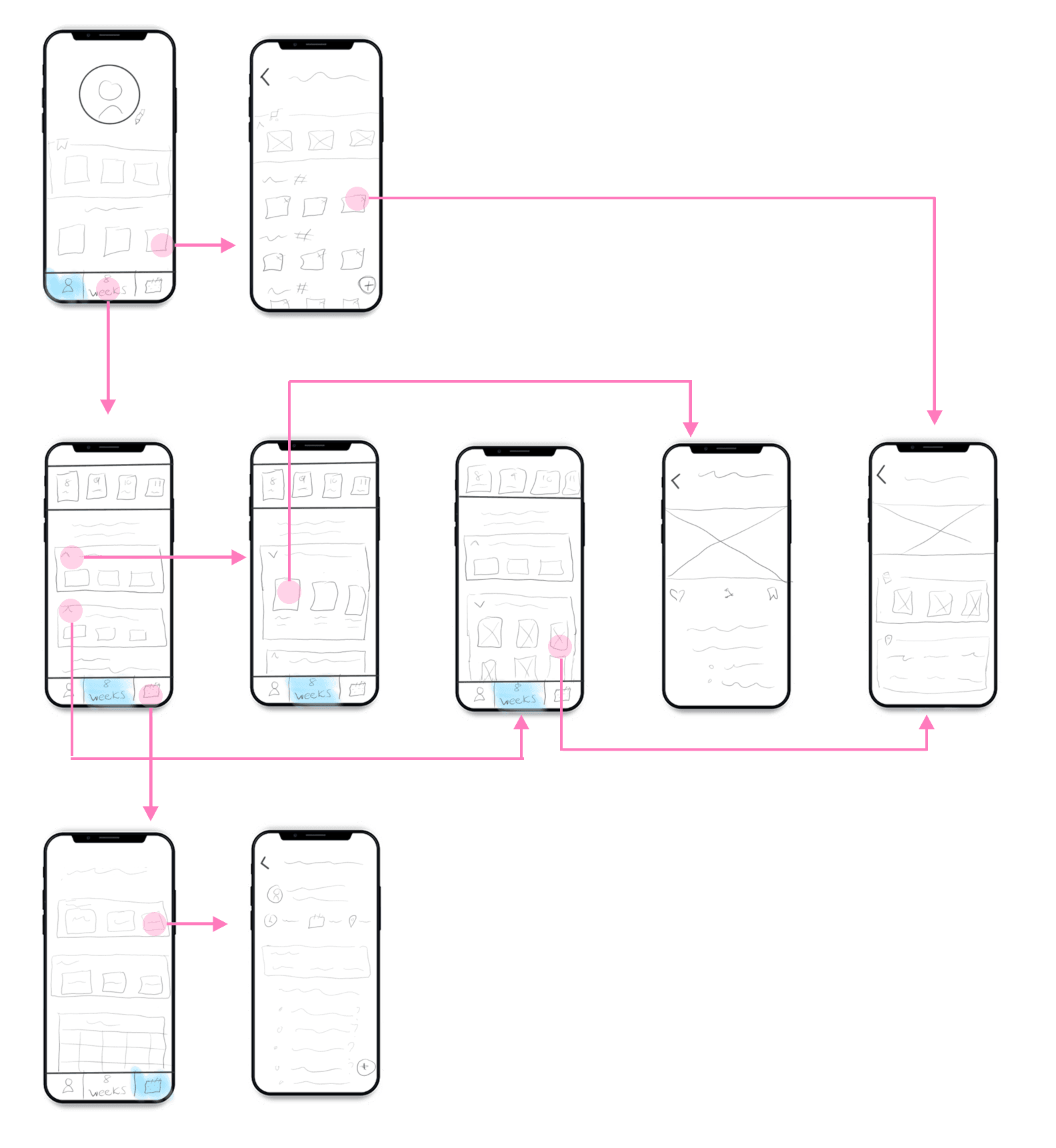
We mapped out the full user flow across multiple screens, from onboarding through core features, ensuring every journey step connected logically to the next.
Rapid Iteration & Usability Testing
Early wireframe testing allowed us to iterate quickly, uncover gaps, and refine areas where clarity or flow needed improvement throughout the process.
Three Goals, Every Decision
Throughout every wireframe round, we kept our three core goals front and center: doctor appointment support, guided baby shopping, and curated content.
Annotated Screens
Every element on the Main and To-Do Detail screens is numbered and mapped to its function, type spec, and behavior, down to the message rotation on the all-done state and the two-step delete flow.

Pattern Library & Handoff Spec
The wireframes shipped with a full pattern library: six content-box styles with sizes and character limits, a complete type scale, and every button annotated with its OnTap behavior. Engineering could build from the spec without a single follow-up meeting about how a component works. Recreated below from the shipped spec document.
Type Scale · Circular Std
Buttons · Every Tap Specified
OnTap: initiates completed-task animation
In-box CTA: gray & white · OnTap: loads target screen
Saved8
Weeks old⚙
Settings
Weeks old: slides up week-selection action sheet · advances every 168 hours
Next week: moves To-Do forward · Delete: 2-step flow
Content Boxes · 6 Styles, Fixed Sizes & Char Limits
Box A · 350×350
H2 · 28 char
Box B · 350×500
H1 · 32 char/2 ln
Box C · 350×350
H1 · 18 char/1 ln
Box D · Ad · 350×176
CTA loads ad
Box E · 350×350
H1 over image
Completed · 350×176
✓ DONE! state
Lo-Fi Prototype
Low Fidelity Prototype
Creating a low-fidelity prototype allowed us to conduct usability testing early, identify what worked in the flow, and iterate on areas that needed improvement. The lo-fi prototype surfaced critical navigation issues before any visual polish was applied.
Wireframe Summary
Through multiple iterations and rounds of usability testing, we finalized the user flow and overall structure for the MVP. Early wireframe testing allowed us to iterate quickly, uncover gaps, and refine areas where clarity or flow needed improvement. Throughout the process, we kept our three core goals front and center while designing solutions.
High Fidelity
Business Goal & Final Design
Delivering on the Business Goal
The business asked our team to create an app that could leverage existing company products. While meeting that goal was important, we also wanted to ensure the app was genuinely useful and supportive for mothers in their everyday lives. Through research and user testing, we defined an MVP and roadmap that balanced both user and business needs.
The app connects smart baby products (such as a sleep mat that tracks movement) with timely insights and content to help mothers understand what to monitor and what to read when issues arise. Additional products can be integrated in similar ways, creating a cohesive and supportive experience.
Doctor Appointment Hub
A dedicated space to prepare questions, track to-dos, and review upcoming appointments, so nothing gets forgotten between home and the clinic.
Guided Baby Shopping
Curated, week-by-week product recommendations tied to pregnancy stage, cutting through the overwhelm with trusted J&J-backed guidance.
Digestible Content Library
Leveraging J&J's existing article library, content is surfaced in bite-sized formats so mothers can get trusted answers without drowning in information.
Smart Product Integration
Connected to devices like sleep tracking mats, the app surfaces relevant alerts and articles automatically, turning product data into actionable insights.
Key Outcome
"My team and I were proud to deliver a solution that met business goals while providing real value to mothers and expecting mothers."
Balancing J&J's product integration goals with genuine user needs produced an app that mothers found trustworthy, useful, and meaningfully different from generic pregnancy trackers on the market.
Hi-Fi Prototype
The validated MVP in motion: To Do This Week as the home screen, weekly tasks that check off with an I Did It, and content tied to the baby's exact week. Every screen in this walkthrough traces back to a feature mothers ranked in the prioritization study.
Next Steps
What's Next
Key Takeaway
"The most impactful design decisions came from putting mothers at the center, not the product catalogue."
Direct access to J&J's research team and real expectant mothers revealed that trust and simplicity mattered far more than feature count. Every design decision was filtered through the question: does this reduce stress, or add to it? I still start every project by writing down that one filtering question before any screens.
Run another lo-fi prototype iteration to address the key pain points surfaced in testing, then hand a clean, validated spec to engineering.
Expand smart product integrations beyond the sleep mat, bringing in additional J&J baby devices to create a richer, more connected postpartum experience.
Develop an Expert Mode for more experienced mothers and healthcare providers, layering clinical-grade content without disrupting the beginner-first baseline.
Build out the media and content workflow, including personalized article feeds, bookmark collections, and weekly digest emails, to extend product value beyond the app session itself.